Gold Key recipients share the creative processes behind their works

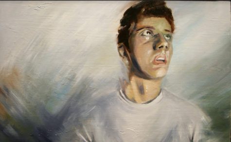
“This painting was an assignment for Drawing II. We were told to find an artist we admire, and do a vstudy on their style and their work with portraiture. I chose Catherine Graffam, because her work was so captivating. The specific inspiration for “Oh Well, I Didn’t Expect That” was a piece by Graffam titled “Panic”. It was beautifully painted, and had lots of emotion. Her work reminded me of another one of my inspirations, Lucian Freud. Her brushwork was messy but the story was clear. I wanted my piece to have the same effect. I wanted to show people my feelings and emotions in a simpler way. Sometimes realism can be boring and sterile, and I think Catherine Graffam’s work showed me that simple ideas can convey a bigger message. I titled the piece “Oh Well, I Didn’t Expect That” because of everything that went into this painting. I wanted to express that there are big and small surprises every day. I realized that sometimes people become so focused on planning their future that they get angry when things unexpectedly change their course. Every single stroke in this piece wasn’t methodically planned and executed. The painting was loose, it was meant to be what I felt at the moment. One day I thought my neck looked fat, so I blurred the edges to make it smaller. Another day I gave myself jaundice (I painted my eyes yellow). When I finished the painting, my teacher Ms. Broge, left a fingerprint in the upper right corner. My painting is being displayed at the Milwaukee Art Museum and it still has her fingerprint. I never expected my painting to win a Gold Key. It was my first time using oils, and I honestly was just experimenting with new techniques. The whole point of the name, “Oh Well, I Didn’t Expect That”, is to illustrate the emotion I wanted to capture. I wanted to show that I am no longer obsessed with everything occurring as planned. When something doesn’t go my way, I simply say “oh well” and move on. This piece and its title made me realize that the importance is in the bigger picture and not the fine details.”
– Jack Magnus (‘18)

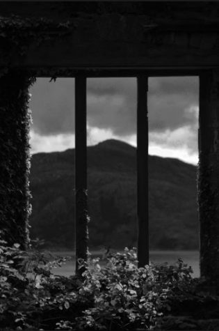
“I took [this photograph] in Scotland at the Clan Macdonald fortress on the Isle of Sky. The funny thing is we thought the fortress was going to be this huge magnificent castle and it was actually just ruins of it, which no one told us! So we were walking around the grounds trying to find the fortress and we were kind of disappointed when we saw it was just the ruins! My fam and I were like “what the heck is this it?” The ruins were blocked off with rails too so like you couldn’t even walk through them! But the view was really pretty of the ocean. And so when we walked around to the back side of the “fortress” I saw the window that looked out at the ocean and I thought that by using the window to frame the ocean and mountain/hill/bluff would be really interesting. And all the weeds and plants growing on the cement definitely added to the picture and made it more interesting. When I took the photo, I wasn’t really thinking about lighting, but once I put it in black and white, the lighting definitely showed through better, with the contrast of the dark and light it made it have more emotion!”
– Megan Moretti (‘17)

